I design at the intersection of brand and experience — where the visual system meets the user's actual moment of decision. My work earns attention first, then trust, then action.
Senior brand and experience designer based in Vancouver. A decade building systems that work at every scale — from transit environments to digital products.
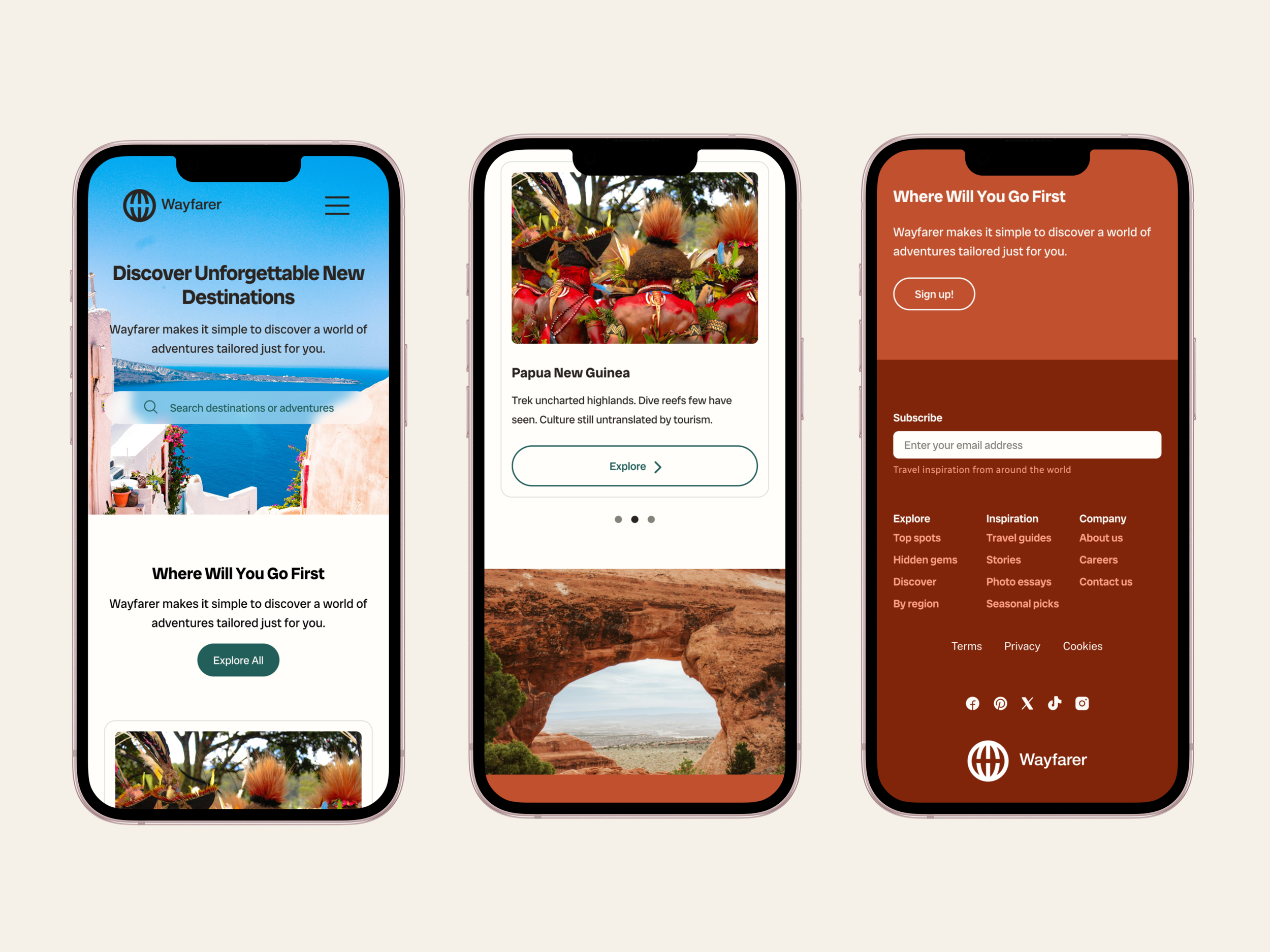
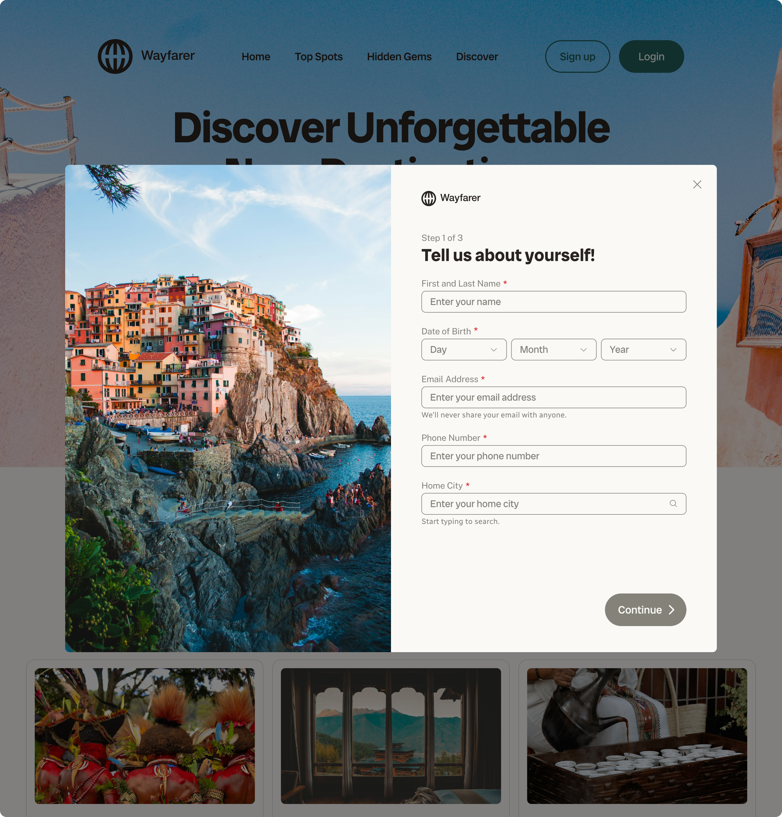
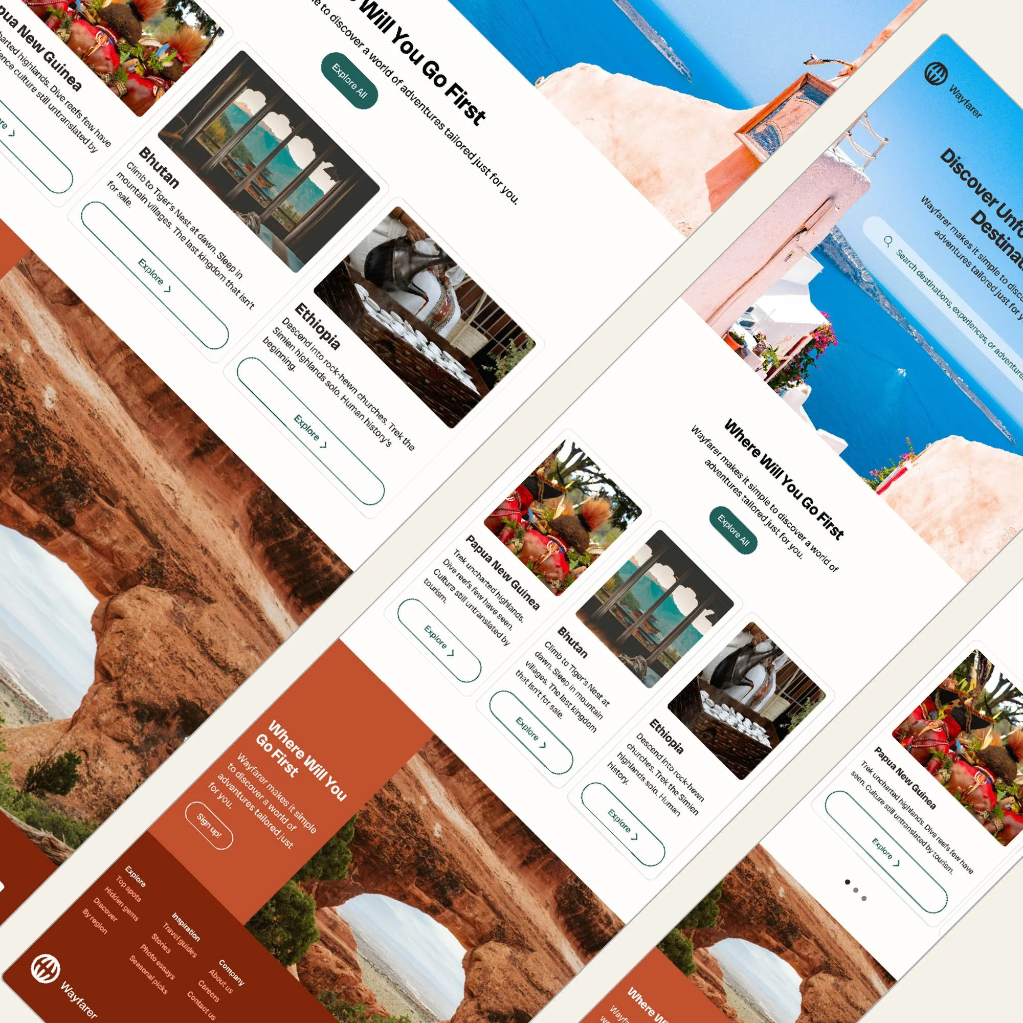
Wayfarer — UX Case Study
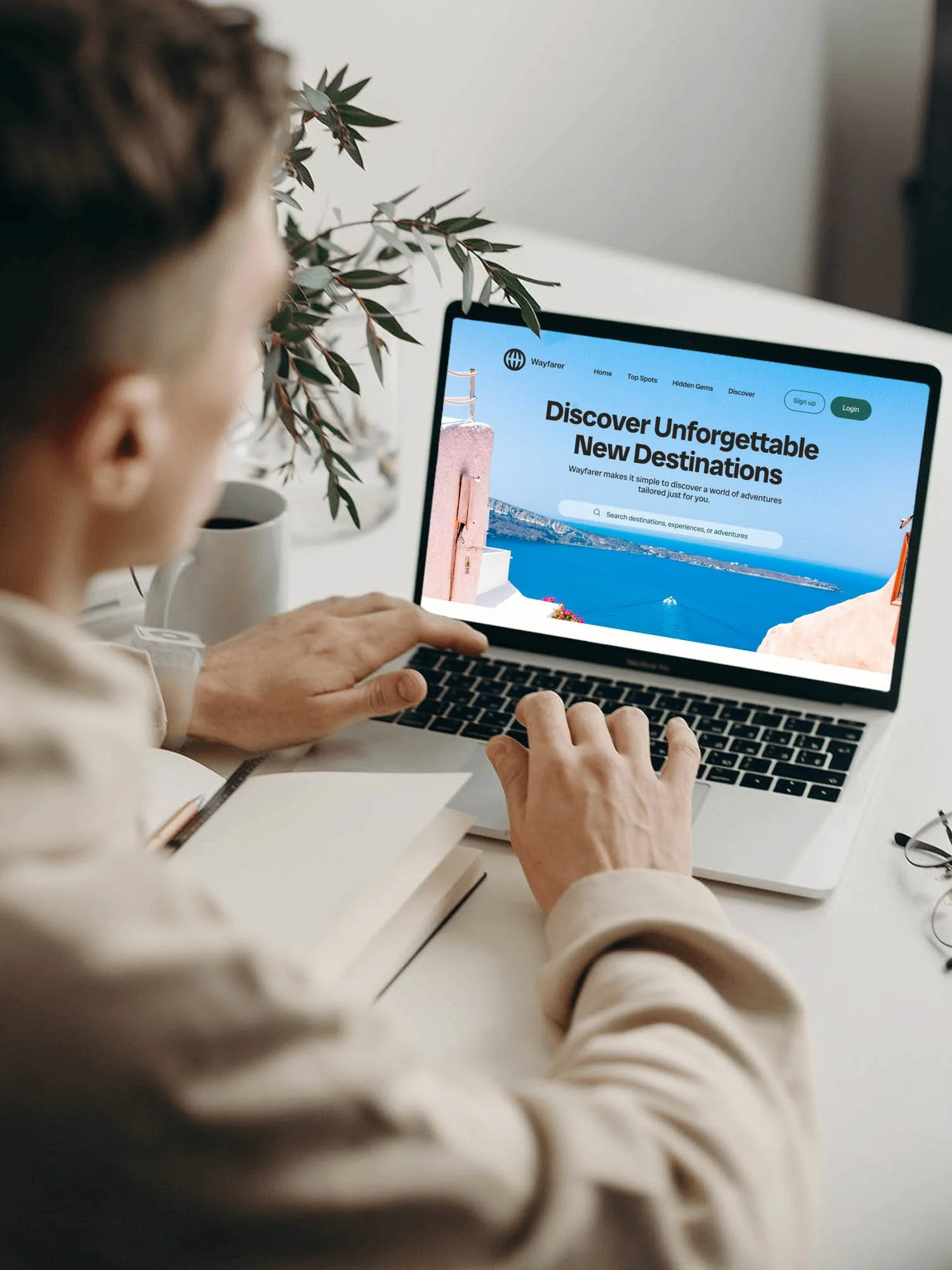
UX DESIGN · INTERACTION DESIGN · FIGMA · PROTOTYPING
A responsive homepage and multi-step sign-up flow for a solo travel brand — designed to earn trust progressively, with every input type chosen to reduce friction at that specific moment in the flow.

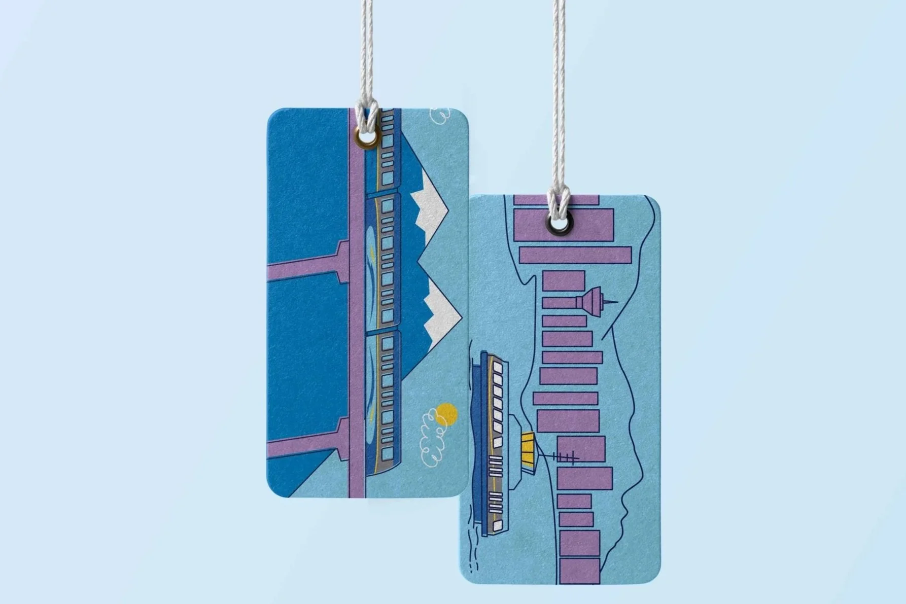
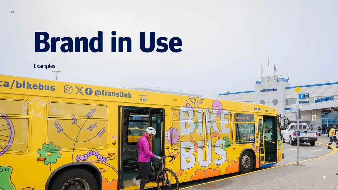
Transit Brand System — Identity to Implementation
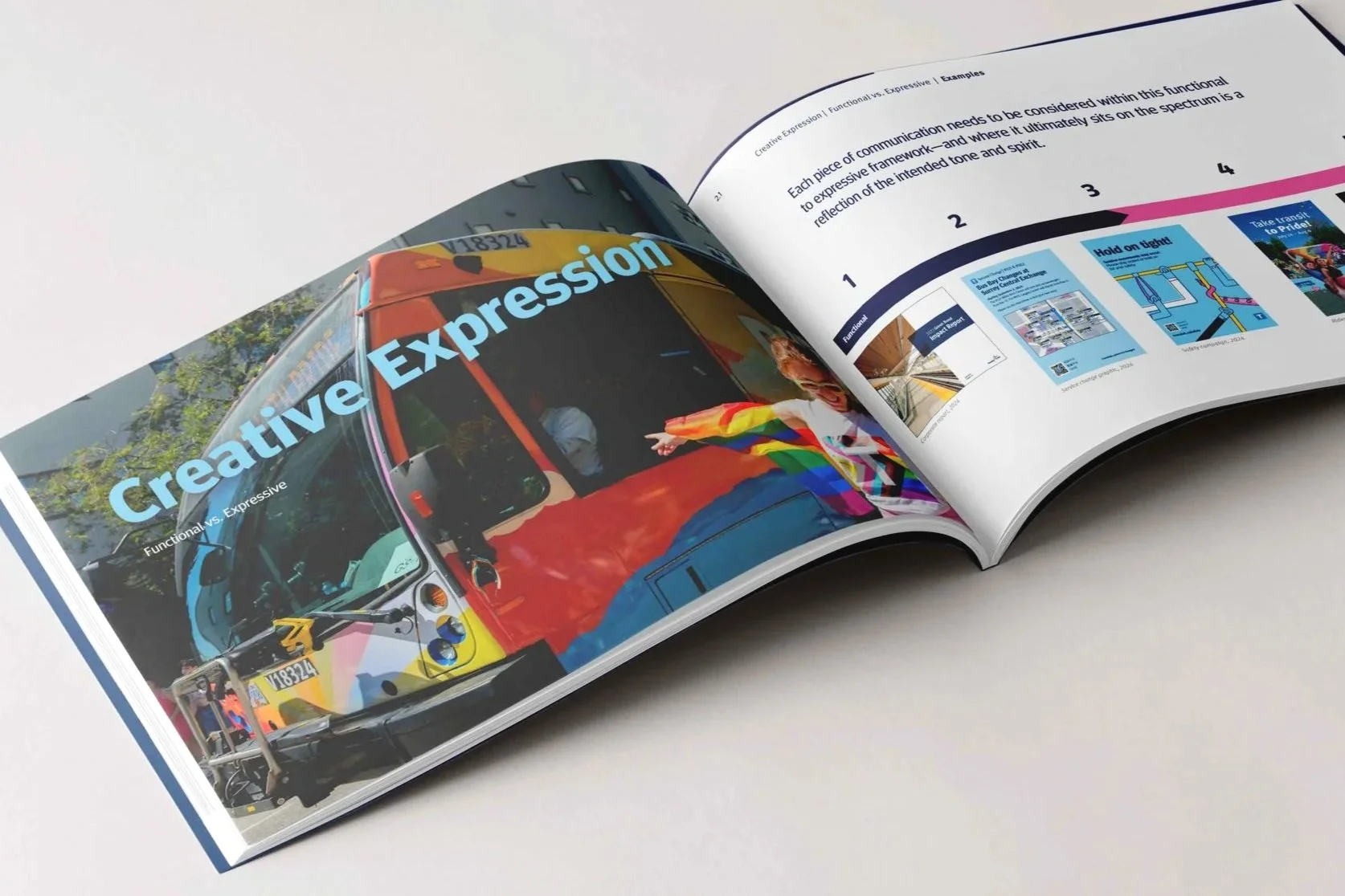
DESIGN SYSTEMS · BRAND ARCHITECTURE · ACCESSIBILITY · ILLUSTRATION SYSTEMS
A ground-up brand system rebuild for one of Canada's largest transit authorities — from identity and illustration to WCAG-compliant design tokens, templates, and guidelines used across every touchpoint.
What began as a request to update a 25-year-old logo quickly revealed a larger opportunity: evolve the entire brand system so it could better support modern transit use, expanding communications needs, and increasingly complex touchpoints.
Behaviour Change Campaign System
CAMPAIGN STRATEGY · BEHAVIOUR CHANGE · ART DIRECTION · MULTI-TOUCHPOINT
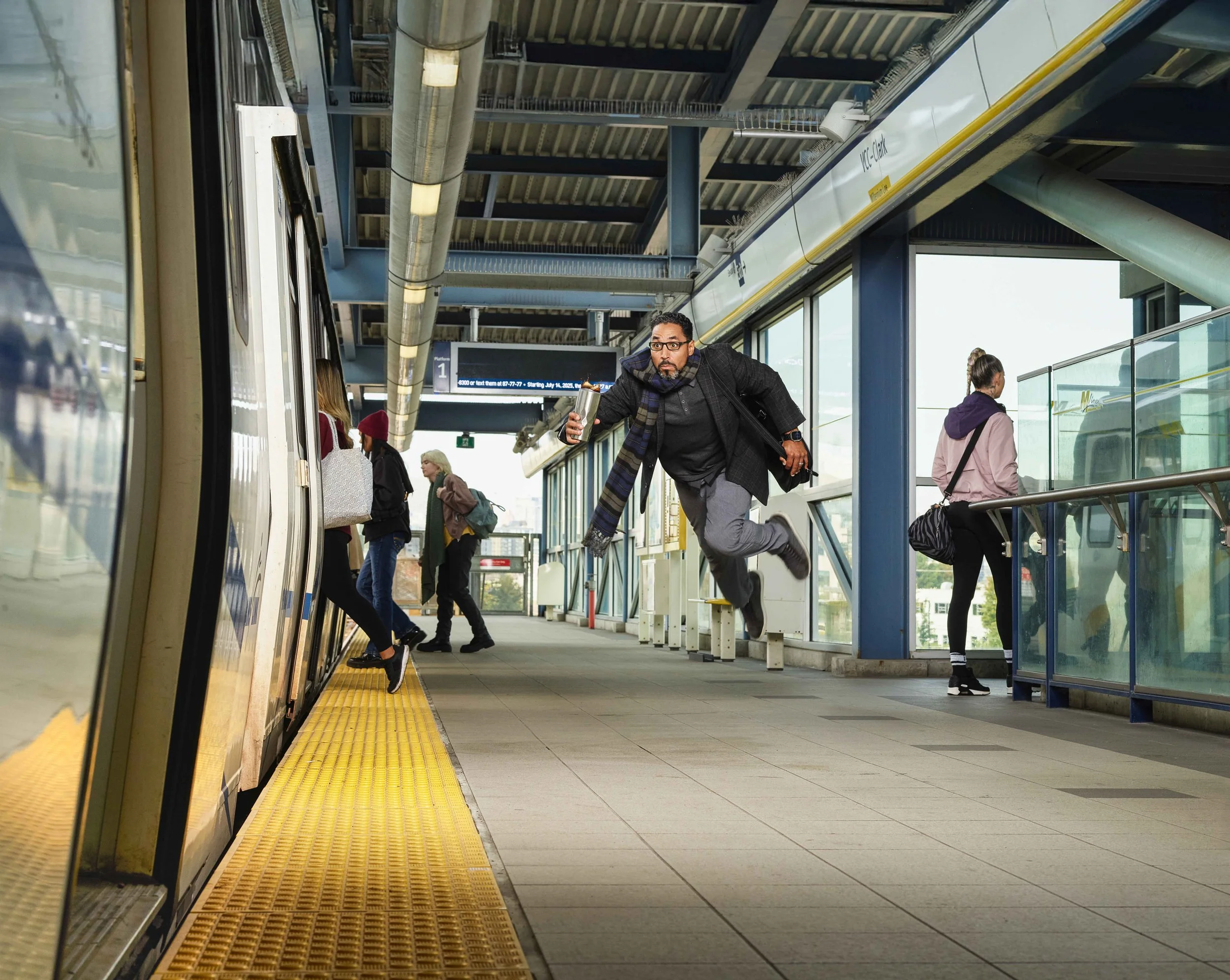
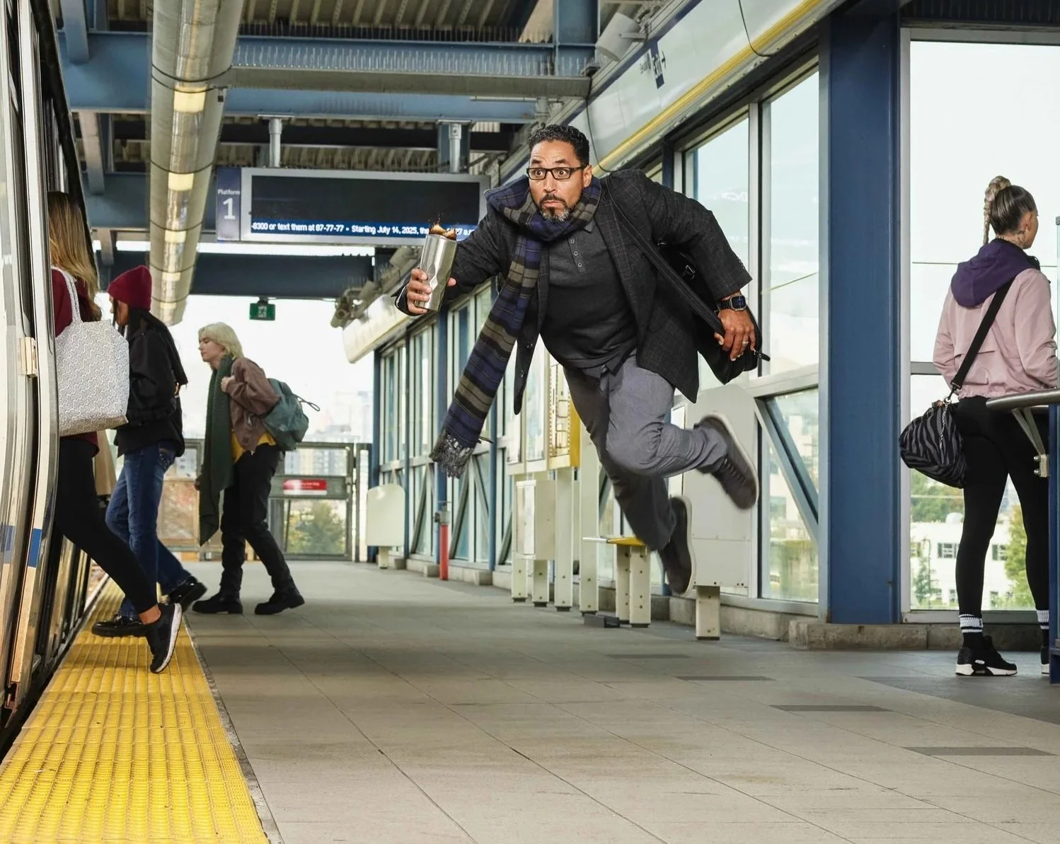
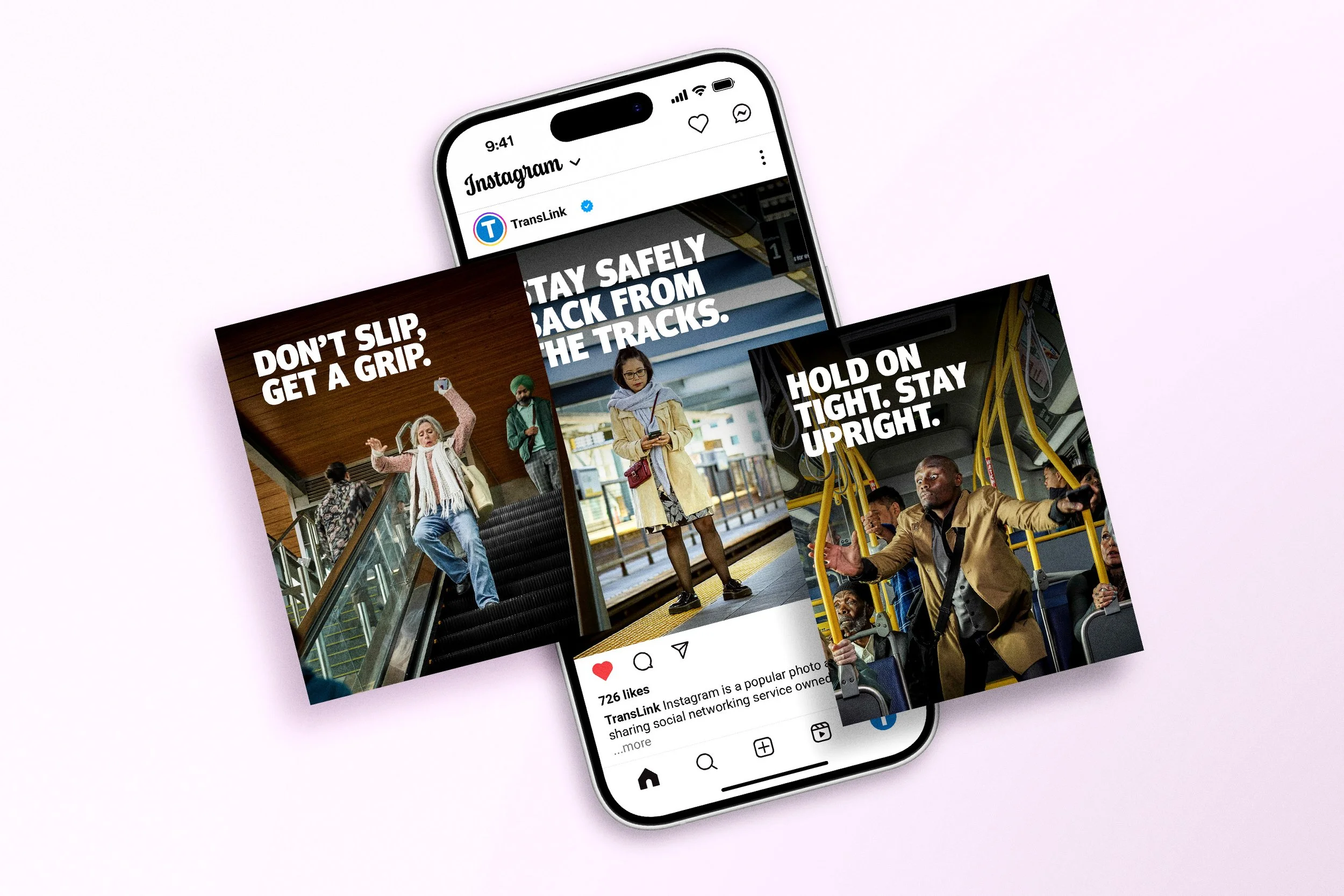
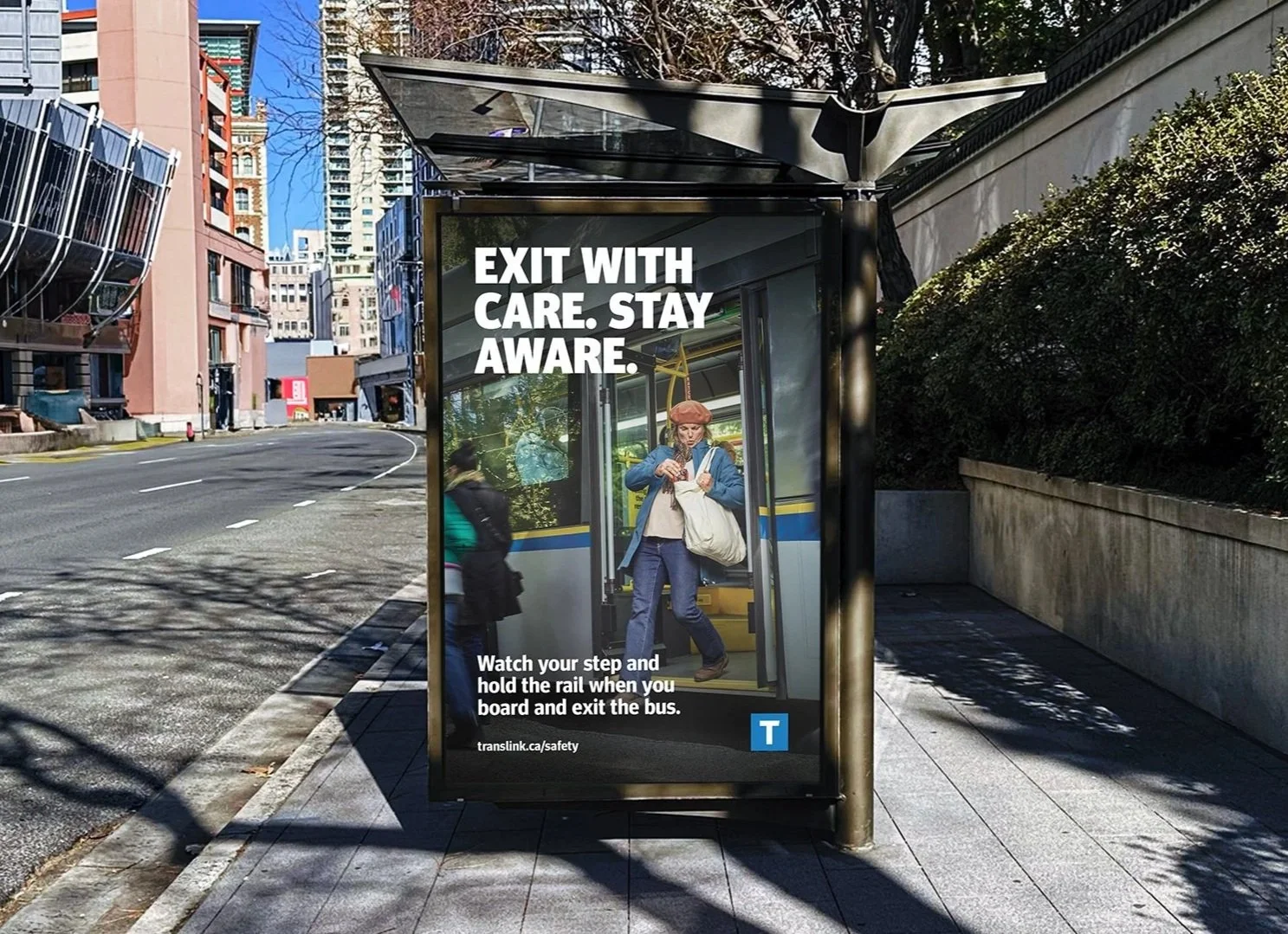
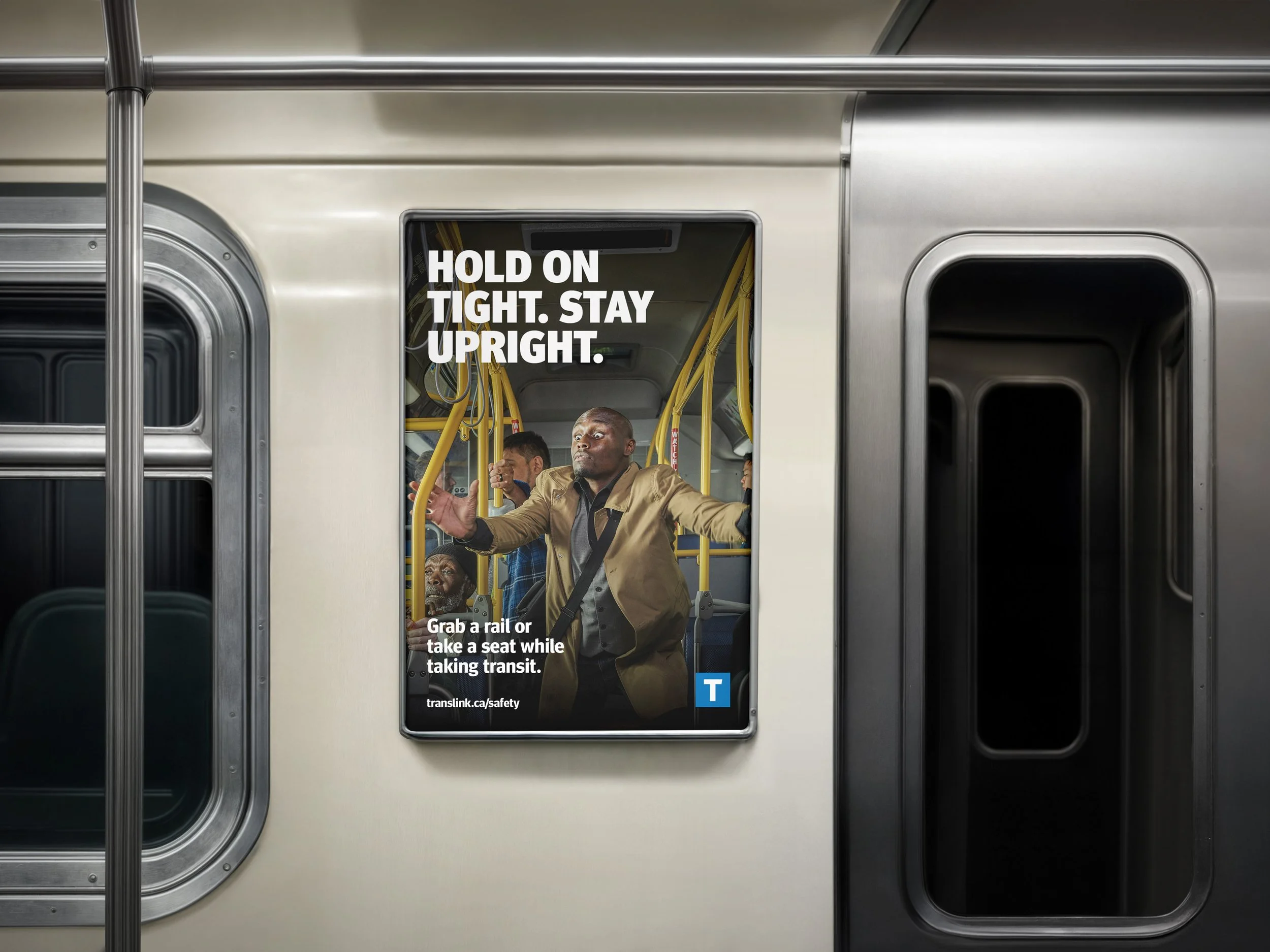
An annual, multi-touchpoint safety campaign designed to encourage behaviour change across transit environments through clear, human, and emotionally resonant brand expression.
I wanted the audience to feel that tiny jolt of recognition — the oh yeah, I’ve definitely done that moment — because that’s where behaviour change starts.

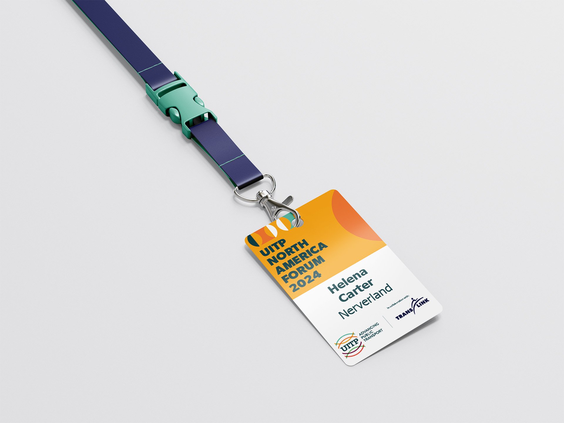
Conference Brand System — Vancouver 2024
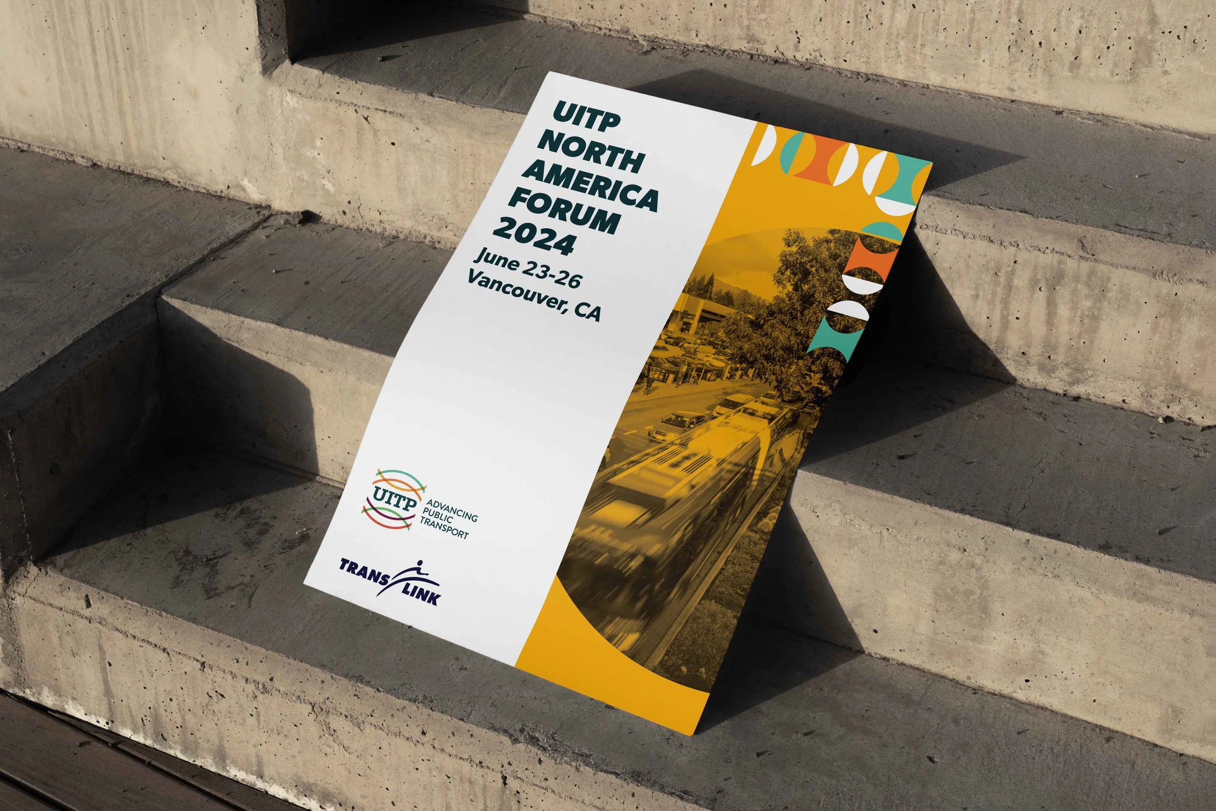
EVENT IDENTITY · ENVIRONMENTAL DESIGN · WAYFINDING · PRODUCTION MANAGEMENT
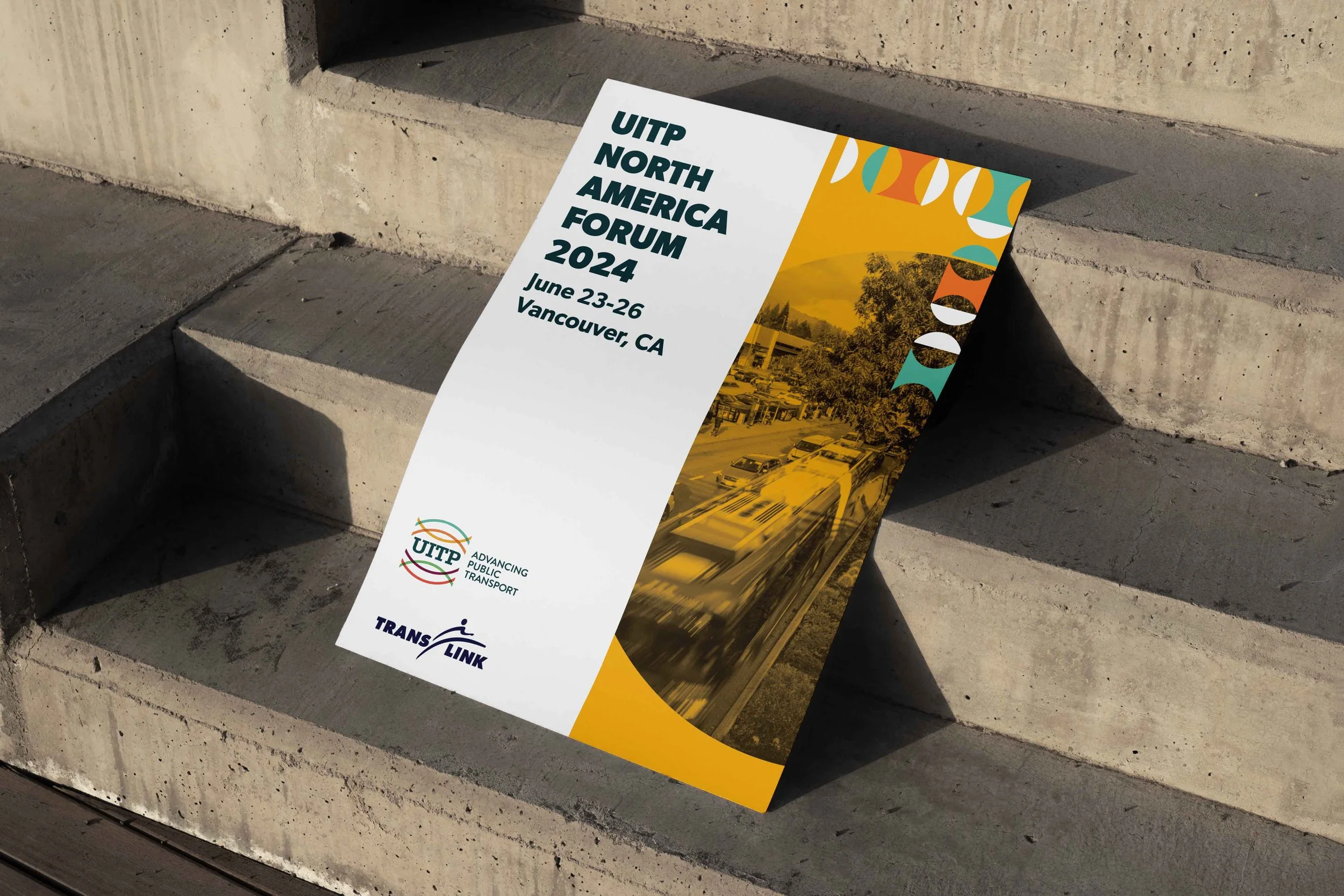
A large-scale conference identity designed to orient thousands of attendees across four days — built for immediate legibility across signage, digital, print, and wearables under live production timelines.
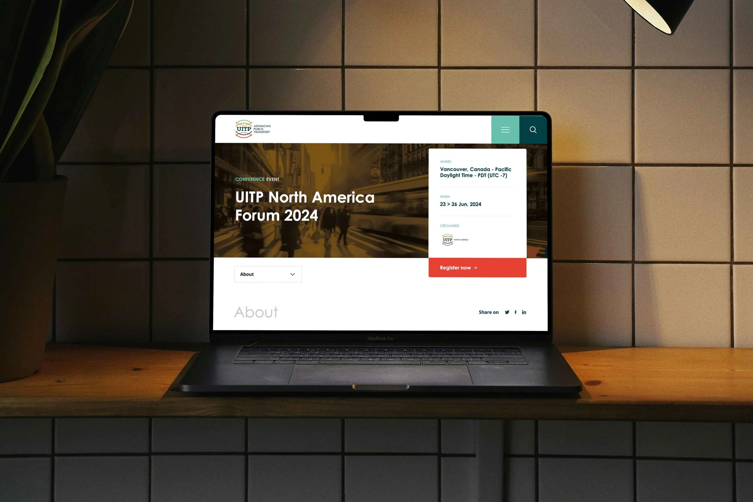
I’ve spent most of my career working in-house, designing within established brands, evolving systems, and delivering campaigns that need to work in the real world — with real people, and real business problems.
My background includes public-facing campaigns, brand refreshes, partnerships, and event branding, often within complex approval structures and tight timelines.

I work at the point where brand thinking, collaboration, and execution meet.
I care deeply about clarity, accessibility, and creating work that respects both audiences and the teams behind it.
I believe great brand work makes complex ideas feel clear, human, and purposeful — and scales across platforms without losing its soul.